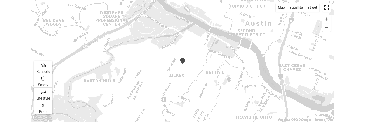
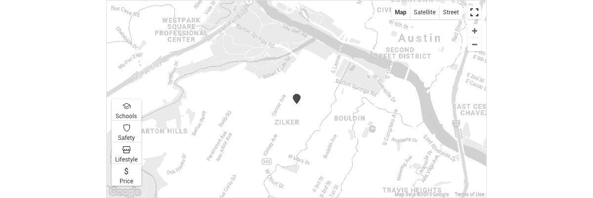
Map Component at realtor.com®
Homebuyers and renters depend on maps to browse available properties. They also wish to see contextual information surrounding those properties. I led the design overhaul by synthesizing user’s and business’s needs, and created a consistent and cohesive map experience for our 60 million+ users of realtor.com. The new design eliminated all complaints on the map experience and converted irritated users to confident and engaged users.
PROBLEMS
User problems- Lack of information on crime, schools, market prices, hazards
- Inconsistent interfaces and missing controls
- Slow page performance, due to multiple instances of Google Maps
- Unhappy users, contributing to the low CSAT and number of criticisms
- Wasted money, due to multiple instances of map on several key pages
- Expensive and complicated implementation, as there were multiple maps controlled by multiple teams, each with its own design and code
UNDERSTANDING
I took this opportunity to make the best map experience in the real estate industry, and shift user’s pain points to a successful experience. Hypothesis: homebuyers will be more engaged and more empowered to make the right decision in their home buying journey, when they see the information they need on the map. Another hypothesis: solving user problems would also solve our business problems.
I conducted a comparative analysis of products that utilized maps well. I learned about map layers, clusters, interactions, and how a map would behave adaptively to a device. After finding features relevant to real estate, we ran a quick MaxDiff analysis, which provided further insights into how users value the different map features. I worked with a product manager and a dev lead to prioritize features and add them into our product backlog.
DESIGN
We learned that crime and school data were crucial for our users and became our top priority to tackle. While the industry relations team worked with the product manager to find the right vendors for crime data, I tackled the next issue of inconsistent (and sometimes missing) controls. I worked with designers and product managers from the different branches of our services to fully understand their unique solutions for the map within their respective product. With that knowledge, I proposed to unify the different interfaces, and to limit customizations that are only to benefit the users.
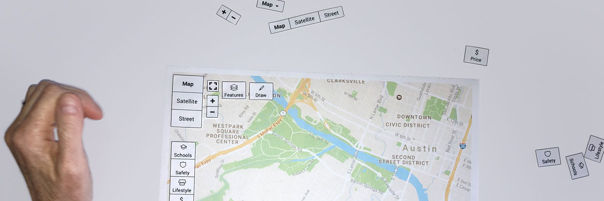
I tested a paper prototype of a map with different modes of controls, and discovered from research participants how they would expect to place the controls and how the control would behave. Additionally, the participants expressed what they expect to learn from each of the map features. This simple exercise shaped how a map can purposefully serve homebuyers and renters, and provided me with guidance in making interactive prototypes. In the following usability study, research participants tried interactive mobile and desktop prototypes. This study was crucial in determining if I had designed the right solution for the map. Research participants expressed their joy when they discovered rich information that overlaid the map. At the same time, they complained of the redundant number of clicks to get things done, as there were different options for each map feature. I learned to forgo consistency for the sake of clarity and usability.
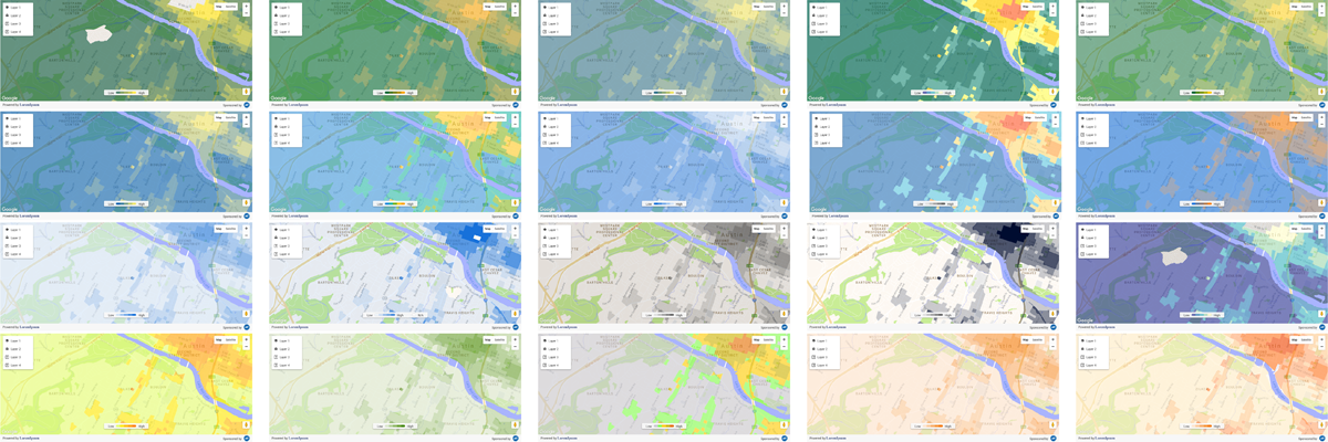
One of the challenges I encountered was to find the right color palette for the crime layer. Initially I used a common palette of red-yellow-green. However, the National Association of REALTORS
Another conflict: our legal team and the NAR requested a change on the label “Crime.” The legal team proposed to use the label “Safety” to reduce the alarming nature of the word “crime.” REALTORS
WORKING WITH DEVELOPERS
I invited my developer counterparts to meetings early in the process, so that they understood why we redesigned the map component and what to expect from the final product. We collaborated often to discuss the different options that a map feature would have and how users would interact with the map. We also worked together to implement a map on different parts of our services and platforms. To ensure the longevity of our work, we devised how to extend the component and planned for future growth.
I created a set of illustrations for the developers to show how a map would behave adaptively on different devices and how certain elements transformed to accommodate an optimal experience.
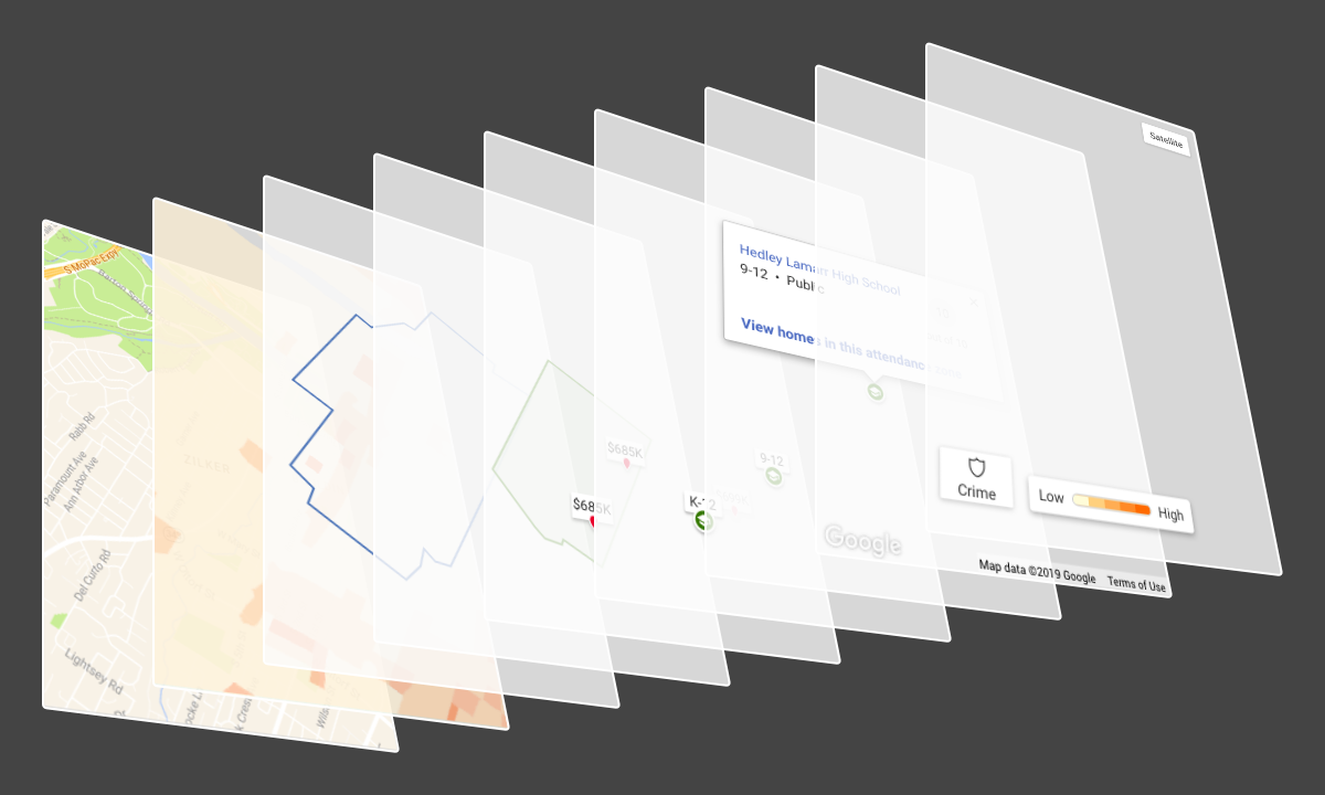
My development team and I worked together to solve how to fuse the different layers systematically to a clean and cohesive visual. My goal was to make every single element—typography, pins, boundaries, heat map, tooltip, legends—highly visible and easily discoverable.
KEY RESULTS
We launched the renovated map component on time, despite the tight deadline. The component featured school, crime, and amenity data overlays with a consistent interface throughout our services. Two weeks following the launch we added information on public transportation, traffic, and bicycle lanes. How did we do?
- Negative reviews on the map experience were completely eliminated
- Positive user comments, notably on school, crime, and amenity overlays
- More views on for sale listings, driven by engaged and informed users
- On a personal accomplishment, the map redesign won the realtor.com’s Demofest, a company’s event of new products!
- Additionally:
- Faster page load, as we used a single instance of Google Maps
- Faster TTFB (Time to First Byte), as the map was loaded on demand
- Better performance also sends a positive signal to SEO
In summary, map users are informed, empowered, and engaged users. The extra information users saw on a map enriched their understanding of the area, drove them to view more listings, and empowered them to make a better decision. They stay within our product, because they did not need to go to another place to learn about schools, crime, or local amenities.
Do you want to learn about the details or see the numbers? Or, do you need design help? Contact me.
